tidyTuesday on Superbowl Commercials
The tidyTuesday data for the week of March 4, 2021 represent 247 rows of Superbowl advertisements coded on a few dimensions by fivethirtyeight. The original article uses 233 and there are a few with at least some missing features in the dataset. The idea was to use binary evaluations of patriotic, funny, uses sex, and a host of other characteristics to describe the universe of Super Bowl ads. One thing that stands out is the difference between Budweiser and Bud Light. Here is a brief look at the data that we have.
screenshot of tidyTuesday description of superbowl commercials
The data look like this…
youtube <- readr::read_csv('https://raw.githubusercontent.com/rfordatascience/tidytuesday/master/data/2021/2021-03-02/youtube.csv')
head(youtube)
## # A tibble: 6 x 25
## year brand superbowl_ads_dot_… youtube_url funny show_product_qu… patriotic
## <dbl> <chr> <chr> <chr> <lgl> <lgl> <lgl>
## 1 2018 Toyota https://superbowl-… https://www… FALSE FALSE FALSE
## 2 2020 Bud L… https://superbowl-… https://www… TRUE TRUE FALSE
## 3 2006 Bud L… https://superbowl-… https://www… TRUE FALSE FALSE
## 4 2018 Hynud… https://superbowl-… https://www… FALSE TRUE FALSE
## 5 2003 Bud L… https://superbowl-… https://www… TRUE TRUE FALSE
## 6 2020 Toyota https://superbowl-… https://www… TRUE TRUE FALSE
## # … with 18 more variables: celebrity <lgl>, danger <lgl>, animals <lgl>,
## # use_sex <lgl>, id <chr>, kind <chr>, etag <chr>, view_count <dbl>,
## # like_count <dbl>, dislike_count <dbl>, favorite_count <dbl>,
## # comment_count <dbl>, published_at <dttm>, title <chr>, description <chr>,
## # thumbnail <chr>, channel_title <chr>, category_id <dbl>A basic visualization
library(hrbrthemes); library(magrittr)
# Fix the spelling of Hyundai
youtube %<>% mutate(brand = recode(brand, Hynudai = "Hyundai"))
# Grab the top 75 most likes and plot them
youtube %>% top_n(75, like_count) %>% group_by(brand) %>% summarise(Count = n()) %>% mutate(legendV = paste(brand, sep="-")) %>% ggplot() + aes(x=fct_reorder(legendV, Count), y=Count, fill=legendV) + geom_col() + coord_flip() + labs(x="Brand", title="Top 75 Ads in Likes by brand") + theme_ipsum() + guides(fill=FALSE)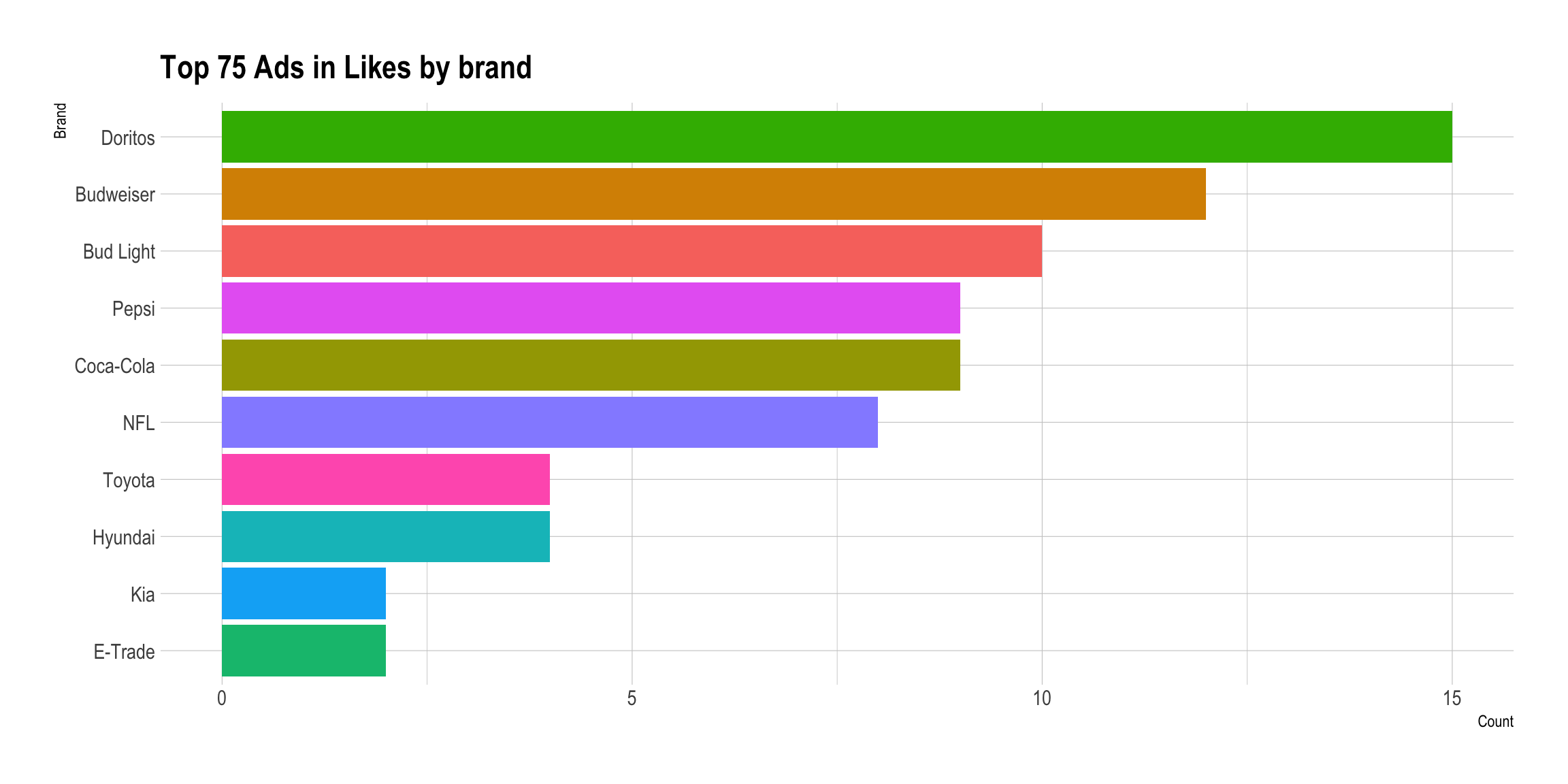
Doritos seems to have the most popular commercials followed by Budweiser and Bud Light, Pepsi and Coca-Cola. Were we to combine Budweiser and Bud Light, they would clearly come out on top.
Now to slice it up a little bit. There are only ten brands in the dataset of 247 ads.
youtube %>% janitor::tabyl(brand) %>% arrange(n)## brand n percent
## NFL 11 0.04453441
## Toyota 11 0.04453441
## E-Trade 13 0.05263158
## Kia 13 0.05263158
## Coca-Cola 21 0.08502024
## Hyundai 22 0.08906883
## Doritos 25 0.10121457
## Pepsi 25 0.10121457
## Budweiser 43 0.17408907
## Bud Light 63 0.25506073Sex-Themed Ads?
One category that I did not expect was sex-themed ads. How often do those occur and what brand chose this form?
youtube %>% group_by(brand, use_sex) %>% summarise(Count = n()) %>% ungroup() %>% pivot_wider(names_from=use_sex, values_from = Count) %>% data.frame() %>% mutate(TRUE. = replace_na(TRUE., 0), Total = FALSE. + TRUE., prop = TRUE./Total) -> Brand.Prop
youtube %>% group_by(brand, use_sex) %>% summarise(Count = n()) %>% left_join(., Brand.Prop) %>% ggplot() + aes(x=fct_reorder(brand, prop), y=Count, fill=use_sex) + geom_col() + coord_flip() + scale_fill_ipsum() + theme_ipsum() + labs(fill="Sexually Themed?", title="Super Bowl Ads by Brand and Sex-Themed", x="Brand", caption="Sorted by Proportion of Sex-Themed Ads")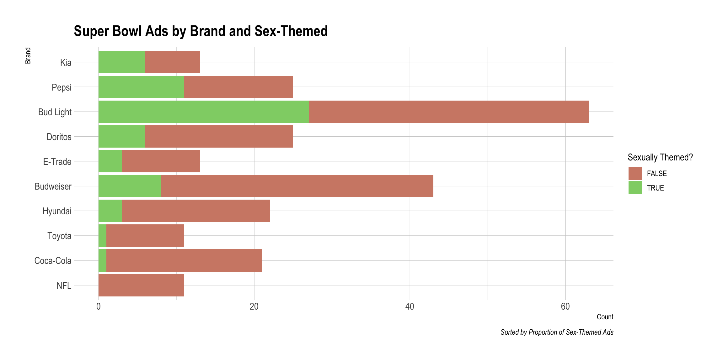
I think I like that basic method of visualization. For this tidyTuesday, I will build it into a function so that I can repeat it for the various characteristics.
A Function
Now I want to build a basic function that will take the data and whatever variable I wish to fill on and render the data wrangling and plotting automagically. I will need rlang to handle the passing of the variable name along with the companion !! method of address and as_name to build the caption and title elements. When I began writing it, I was only going to pull the data together but then I remembered as_name and could complete it; it bears the unfortunate name DataMaker for this reason.
DataMaker <- function(data, var) {
var <- enquo(var)
data %>%
group_by(brand, !! var ) %>%
summarise(Count = n()) %>%
ungroup() %>%
pivot_wider(names_from=!! var, values_from = Count) %>%
data.frame() %>%
mutate(TRUE. = replace_na(TRUE., 0),
Total = FALSE. + TRUE.,
prop = TRUE./Total) %>%
select(brand, Total, prop) -> Brand.Prop
data %>%
group_by(brand, !! var) %>%
summarise(Count = n()) %>%
left_join(., Brand.Prop) %>% ggplot() + aes(x=fct_reorder(brand, prop), y=Count, fill=!! var) + geom_col() + coord_flip() + scale_fill_ipsum() + theme_ipsum() + labs(fill=as_name(var), title=paste0("Super Bowl Ads by Brand and ",as_name(var)), caption=paste0("Sorted by Proportion ", as_name(var)), x="Brand")
}
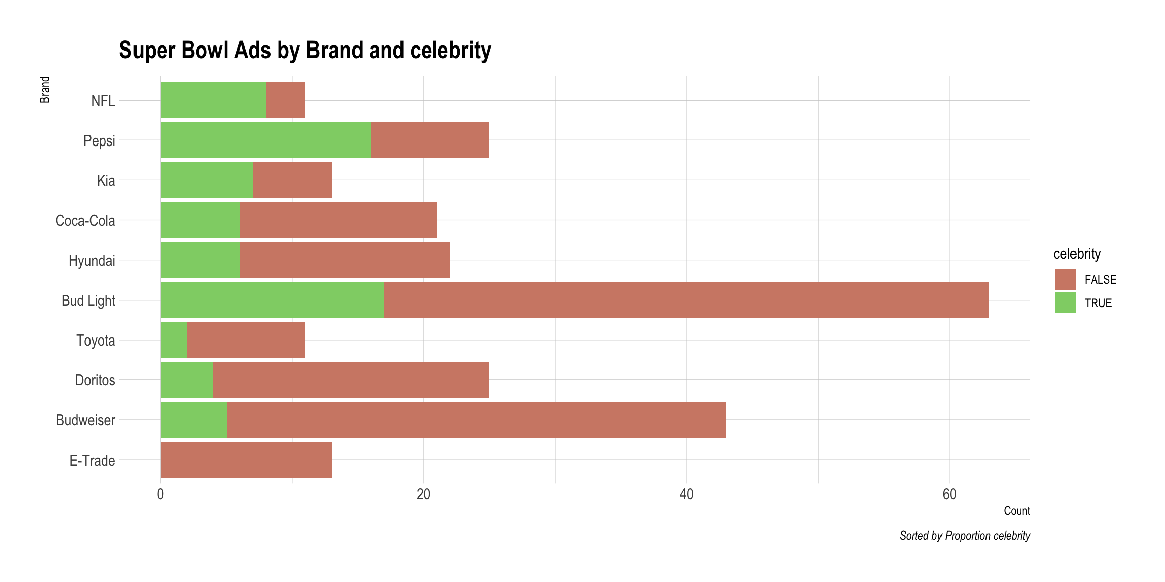
DataMaker(youtube, patriotic)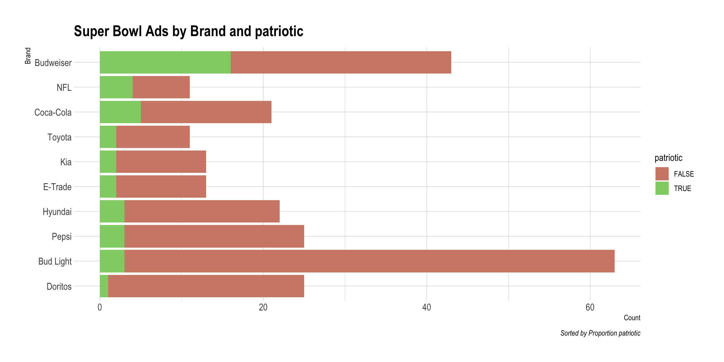
DataMaker(youtube, danger)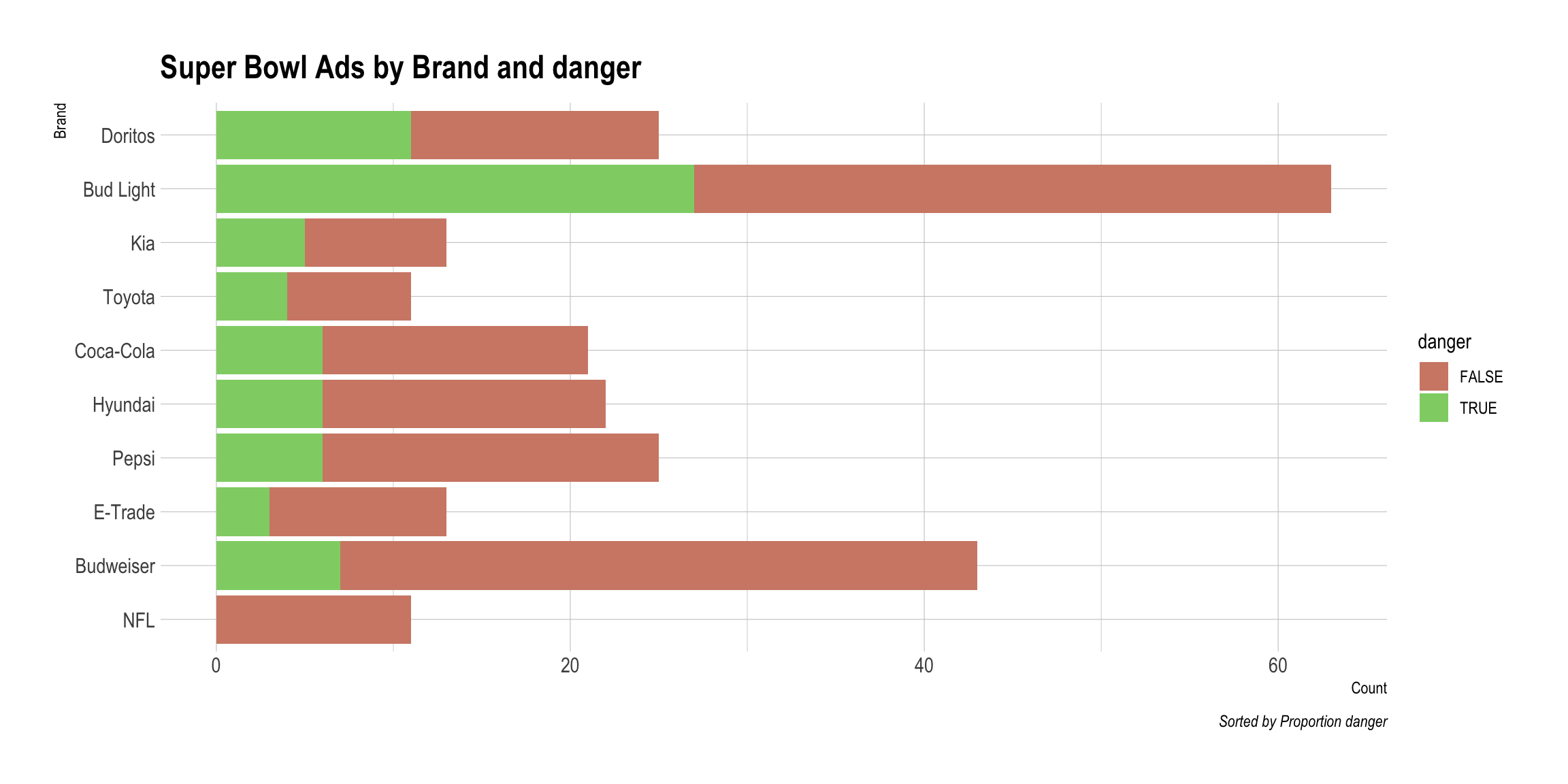
DataMaker(youtube, animals)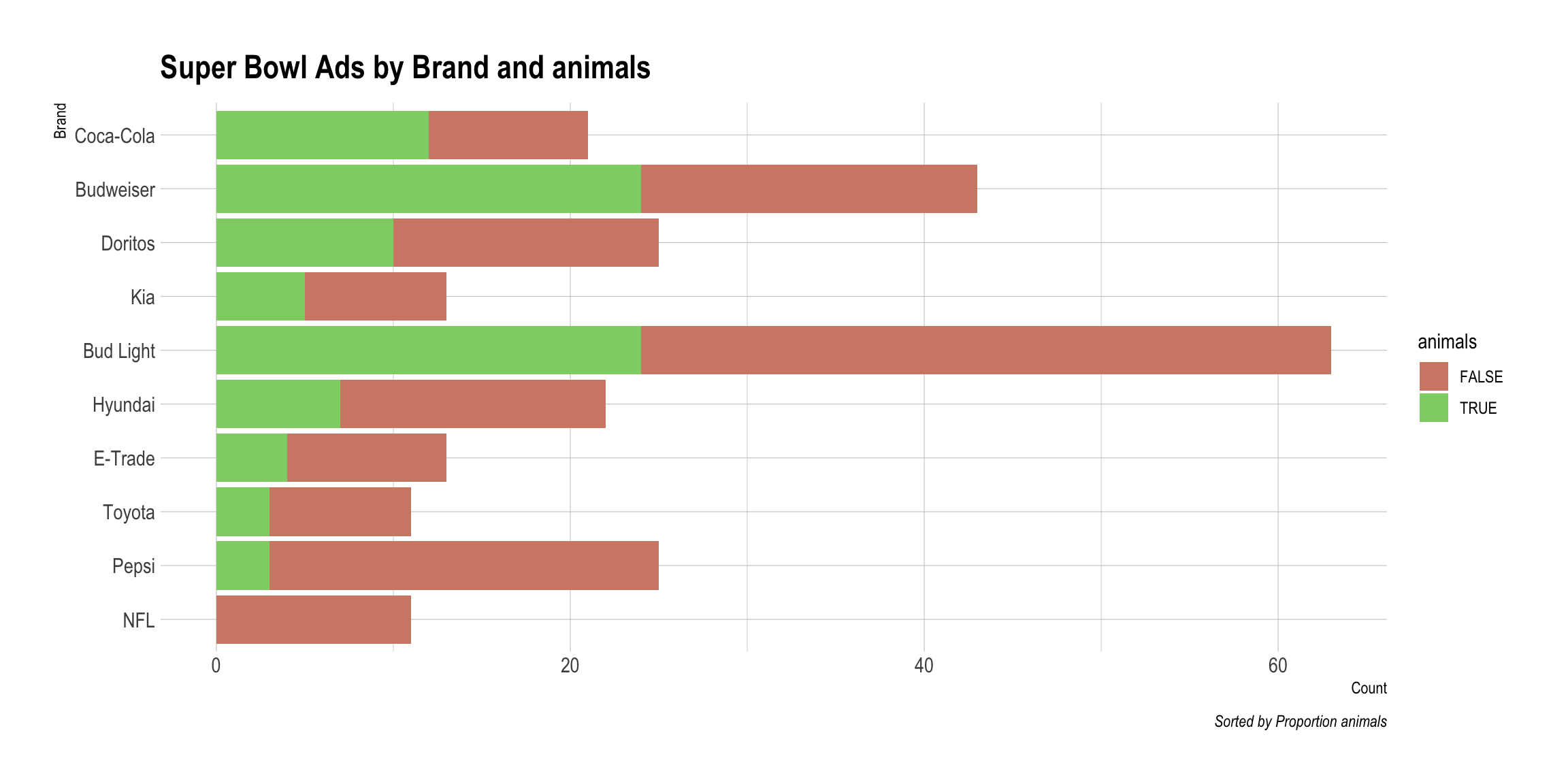
DataMaker(youtube, funny)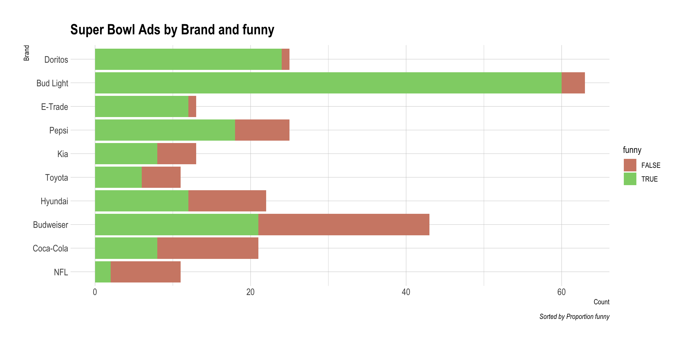
DataMaker(youtube, celebrity)