A Quick tidyTuesday on Beer, Breweries, and Ingredients
Beer Distribution
The #tidyTuesday for March 31, 2020 is on beer. The essential elements and a method for pulling the data are shown:

Imgur
A Comment on Scraping .pdf

The Tweet
The details on how the data were obtained are a nice overview of scraping .pdf files. The code for doing it is at the bottom of the page. @thomasmock has done a great job commenting his way through it.

The footer
This is what one of the tables looks like.

December 2017
Get Data
We are shown two ways of getting the data. We can install the tidytuesdayR package and get all of the collected data up to and including this week from the package or we can copy and paste the relevant code to download them. I will take the latter approach.
library(tidyverse)
brewing_materials <- readr::read_csv('https://raw.githubusercontent.com/rfordatascience/tidytuesday/master/data/2020/2020-03-31/brewing_materials.csv')
beer_taxed <- readr::read_csv('https://raw.githubusercontent.com/rfordatascience/tidytuesday/master/data/2020/2020-03-31/beer_taxed.csv')
brewer_size <- readr::read_csv('https://raw.githubusercontent.com/rfordatascience/tidytuesday/master/data/2020/2020-03-31/brewer_size.csv')
beer_states <- readr::read_csv('https://raw.githubusercontent.com/rfordatascience/tidytuesday/master/data/2020/2020-03-31/beer_states.csv')
Brewers
library(skimr)
skim(brewer_size)| Name | brewer_size |
| Number of rows | 137 |
| Number of columns | 6 |
| _______________________ | |
| Column type frequency: | |
| character | 1 |
| numeric | 5 |
| ________________________ | |
| Group variables | None |
Variable type: character
| skim_variable | n_missing | complete_rate | min | max | empty | n_unique | whitespace |
|---|---|---|---|---|---|---|---|
| brewer_size | 0 | 1 | 5 | 30 | 0 | 16 | 0 |
Variable type: numeric
| skim_variable | n_missing | complete_rate | mean | sd | p0 | p25 | p50 | p75 | p100 | hist |
|---|---|---|---|---|---|---|---|---|---|---|
| year | 0 | 1.00 | 2014.18 | 3.19 | 2009.00 | 2011.0 | 2014 | 2017.0 | 2019 | ▇▆▆▆▆ |
| n_of_brewers | 0 | 1.00 | 612.35 | 1313.52 | 3.00 | 15.0 | 43 | 428.0 | 6400 | ▇▁▁▁▁ |
| total_barrels | 1 | 0.99 | 30796075.13 | 61158938.00 | 0.00 | 1382425.8 | 3055305 | 10513168.2 | 196969275 | ▇▁▁▁▁ |
| taxable_removals | 0 | 1.00 | 28247188.18 | 56377822.87 | 14711.36 | 1203851.8 | 2714929 | 8697815.6 | 182995469 | ▇▁▁▁▁ |
| total_shipped | 2 | 0.99 | 885245.75 | 1854340.92 | 12.00 | 6544.5 | 39494 | 265117.5 | 6908958 | ▇▁▁▁▁ |
The Landscape of Brewers
brewer_sizeT <- brewer_size %>% filter(brewer_size!="Total") %>% group_by(year) %>% mutate(obs = row_number()) %>% ungroup()
brewer_sizeT %>%
  ggplot(.) +
  aes(x = fct_reorder(brewer_size, obs), y = n_of_brewers) +
  geom_col(fill = "#fba29d") +
  coord_flip() +
  theme_minimal() + theme(axis.text.x = element_text(size=8, angle=45), axis.text.y = element_text(size=6)) +
  facet_wrap(vars(year)) +
  labs(x="", y="Number of Brewers")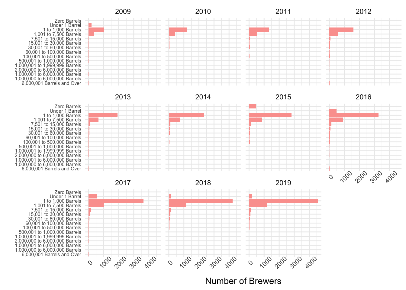
The Rise of Micro-Brews
library(tidyverse)
brewer_size <- readr::read_csv('https://raw.githubusercontent.com/rfordatascience/tidytuesday/master/data/2020/2020-03-31/brewer_size.csv')
brewer_sizeT <- brewer_size %>% filter(brewer_size!="Total") %>% group_by(year) %>% mutate(obs = row_number()) %>% ungroup()
# install.packages("gganimate")
library(gganimate)
brewer_sizeT %>%
  ggplot(.) +
  aes(x = fct_reorder(brewer_size, obs), y = n_of_brewers, group=year) +
  geom_col(fill = "#fba29d") +
  coord_flip() +
  theme_minimal() +
  labs(x="", y="Number of Brewers", title="Brewers by Size", subtitle="{closest_state}") + transition_states(year, transition_length = 5, state_length = 10, wrap=FALSE) + enter_grow() + exit_shrink()
The above code, which requires some supporting stuff [I used gifski], produces:

Animation
My Least Favorite Thing….
The trend is good.
brewing_materials <- brewing_materials %>% mutate(date = as.Date(paste0("01/",month,"/",year), format="%d/%m/%Y"), Month.Pct.Chg = ((month_current - month_prior_year) / month_prior_year))
brewing_materials %>% filter(str_detect(type, "Hops")) %>%  ggplot(., aes(x=date, y=Month.Pct.Chg, color=type)) + geom_line() + geom_point(alpha=0.1) + guides(color=FALSE) + facet_wrap(vars(type), scales = "free_y") + labs(title="Month to Month Last Year Percent Change in Hops")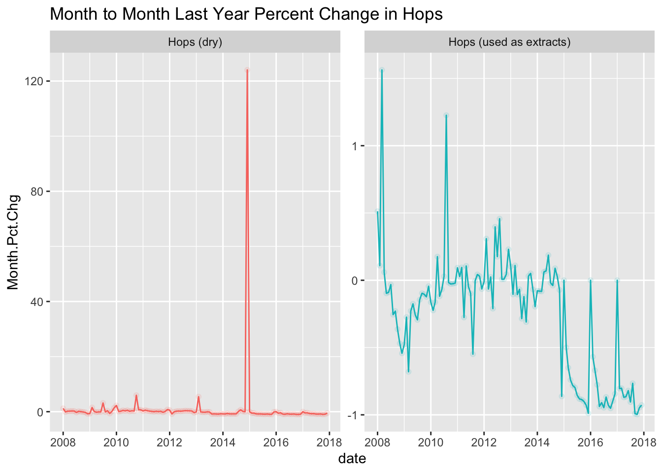
There is something legitimately weird about December 2014. Let me clear it up a bit.
My.brewing_materials <- brewing_materials
My.brewing_materials$Month.Pct.Chg[My.brewing_materials$Month.Pct.Chg > 10] <- 10
Plot1 <- My.brewing_materials %>%
  filter(str_detect(type, "Hops")) %>%
  ggplot(., aes(x=date, y=Month.Pct.Chg, color=type)) +
  geom_line() +
  guides(color=FALSE) +
  facet_wrap(vars(type), scales = "free_y") +
  labs(title="Month to Month Last Year Percent Change in Hops", caption = "Real value for maximum Hops(dry) is 120")
Plot1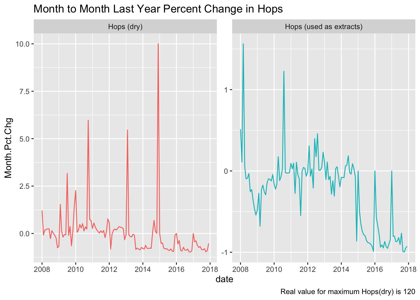
A GeoFacet
These are quite neat though I have yet to figure out how to normalize it. First, I will show the percent changes in total barrels by state and then I will show it in raw terms.
Changes
library(patchwork); library(geofacet)
dataBS <- beer_states %>%
  pivot_wider(names_from=type, values_from=barrels) %>% # Pivot to wide by type
  mutate(Total.Barrels = `On Premises` + `Bottles and Cans` + `Kegs and Barrels`)  %>% # Sum
  select(-c(`On Premises`,`Bottles and Cans`,`Kegs and Barrels`)) %>% # Drop components
  pivot_longer(., Total.Barrels, names_to = "Total.Barrels", values_to = "Barrels") %>% # Back to long
  group_by(state) %>%  # Group the data to calculate changes
  mutate(Percent.Change = (Barrels - lag(Barrels)) / lag(Barrels)) %>% # Calculate changes
  filter(state!="total") %>% ungroup() # Drop totals and ungroup the data.
ggplot(dataBS, aes(x=year, y=Percent.Change, group=state)) +
     geom_line(color="red") +
     facet_geo(~ state) +
     theme_bw() + theme(axis.text.x = element_text(size=4, angle=45), axis.text.y = element_text(size=6)) + labs(title="Change in Barrels [pct]")
## Warning: Removed 65 row(s) containing missing values (geom_path).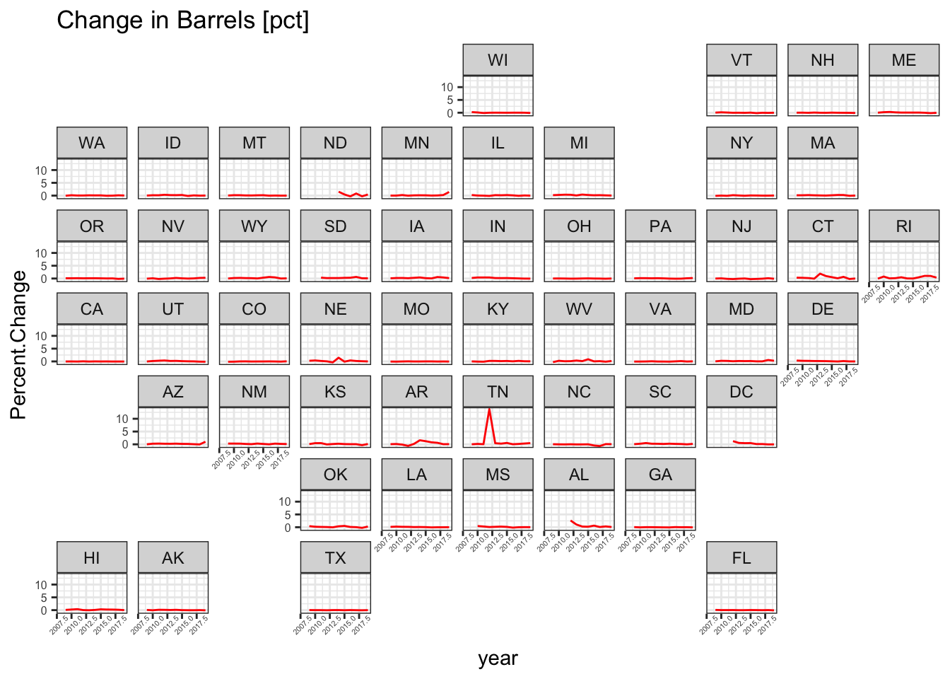
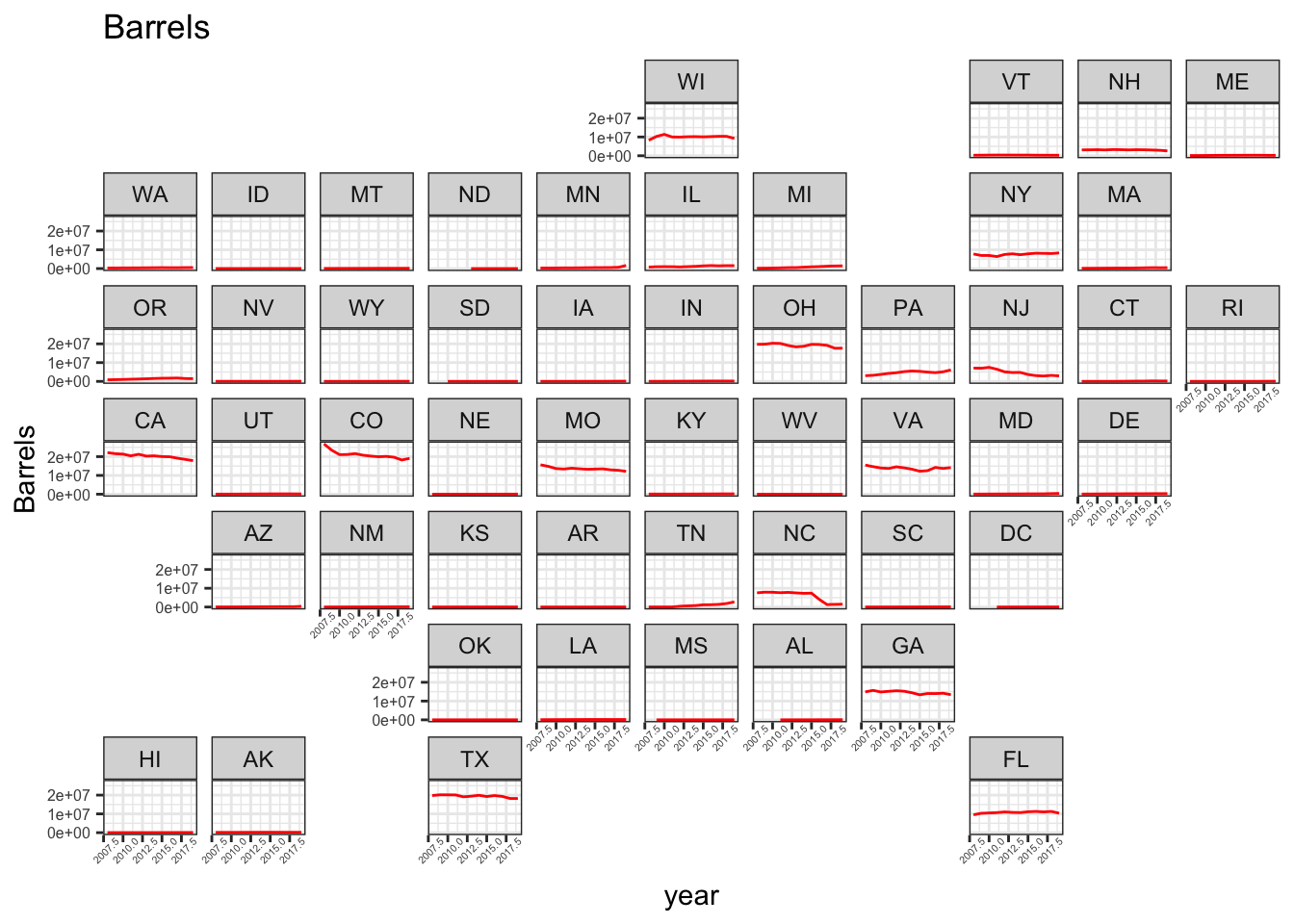
Plot Barrels
ggplot(dataBS, aes(x=year, y=Barrels, group=state)) +
     geom_line(color="red") +
     facet_geo(~ state) +
     theme_bw() + theme(axis.text.x = element_text(size=4, angle=45), axis.text.y = element_text(size=6))  + labs(title="Barrels")
## Warning: Removed 14 row(s) containing missing values (geom_path).