COVID in the US and the World
The Johns Hopkins dashboard
This is what Johns Hopkins has provided as a dashboard using ARCGIS. They have essentially layered out the data into national and subnational data and then used the arcgis dashboard to cycle through them.
The data
There are a few different types of data available. I am relying on the same sources that Johns Hopkins is using for the county level incident data. I don’t really like this because the data are named instances. The New York Times data are easier to work with.
library(tidyverse); library(sf); library(rnaturalearth); library(rnaturalearthdata); library(ggmap)
March26JH <- read_csv(url("https://raw.githubusercontent.com/CSSEGISandData/COVID-19/master/csse_covid_19_data/csse_covid_19_daily_reports/03-26-2020.csv"))
March29JH <- read_csv(url("https://raw.githubusercontent.com/CSSEGISandData/COVID-19/master/csse_covid_19_data/csse_covid_19_daily_reports/03-29-2020.csv"))
A Leaflet
Let’s see what one set looks like. I am doing this first for March 26; after, I will do March 29.
library(leaflet); library(rMaps); library(leaflet.extras)
L2 <- leaflet(March26JH) %>%
  addTiles() %>%
#  addCircles(lng = ~Long, lat = ~Lat, weight = 1, radius = 1, popup = ~Combined_Key) %>%
  addHeatmap(lng=~Long_,
             lat=~Lat,
             radius = 9,
             intensity = ~Confirmed)
library(widgetframe)
frameWidget(L2)
March 29
L2 <- leaflet(March29JH) %>%
  addTiles() %>%
#  addCircles(lng = ~Long, lat = ~Lat, weight = 1, radius = 1, popup = ~Combined_Key) %>%
  addHeatmap(lng=~Long_,
             lat=~Lat,
             radius = 9,
             intensity = ~Confirmed)
library(widgetframe)
frameWidget(L2)
@jburnmurdoch of the Financial Times
Now I will work with the nominal time series of this.
SR.TS <- readr::read_csv(url("https://raw.githubusercontent.com/CSSEGISandData/COVID-19/master/who_covid_19_situation_reports/who_covid_19_sit_rep_time_series/who_covid_19_sit_rep_time_series.csv"))##
## ── Column specification ────────────────────────────────────────────────────────
## cols(
## .default = col_double(),
## `Province/States` = col_character(),
## `Country/Region` = col_character(),
## `WHO region` = col_character(),
## `WHO region label` = col_character(),
## `6/20/20` = col_logical(),
## `6/21/20` = col_logical(),
## `6/22/20` = col_logical(),
## `6/23/20` = col_logical(),
## `6/24/20` = col_logical(),
## `6/25/20` = col_logical(),
## `6/26/20` = col_logical(),
## `6/27/20` = col_logical(),
## `6/28/20` = col_logical(),
## `6/29/20` = col_logical(),
## `6/30/20` = col_logical(),
## `7/1/20` = col_logical(),
## `7/2/20` = col_logical(),
## `7/3/20` = col_logical(),
## `7/4/20` = col_logical(),
## `7/5/20` = col_logical()
## # ... with 42 more columns
## )
## ℹ Use `spec()` for the full column specifications.Something is wrong with the 3/5/2020 column. It has two values; one a number and another parenthetical number. I just replace the value.
SR.TS$`3/5/2020`[18] <- "128"
SR.TS <- SR.TS %>% mutate(`3/5/2020` = as.numeric(`3/5/2020`))
Global Coronavirus Cases
Now it is time to rearrange this data. Let’s start with the global case totals.
SR.Global <- SR.TS %>% filter(`Country/Region`=="Globally") %>% pivot_longer(cols=c(5:dim(SR.TS)[[2]])) %>% pivot_wider(., names_from = `Province/States`, values_from = value) %>% mutate(date=as.Date(name, format = "%m/%d/%Y"))The Plot
ggplot(SR.Global) +
 aes(x = date, y = Confirmed) +
 geom_line(size = 1L, colour = "#c6dbef") +
 geom_point(size = 1L, colour = "#c6dbef") +
 labs(x = "Date", y = "Confirmed Cases", title = "Global Cases of Coronavirus") +
 hrbrthemes::theme_ft_rc()
## Warning: Removed 58 row(s) containing missing values (geom_path).## Warning: Removed 58 rows containing missing values (geom_point).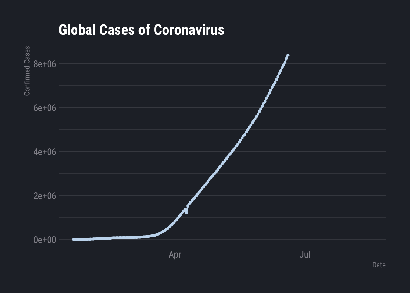
Deaths
ggplot(SR.Global) +
 aes(x = date, y = Deaths) +
 geom_line(size = 1L, colour = "#c6dbef") +
 geom_point(size = 1L, colour = "#c6dbef") +
 labs(x = "Date", y = "Confirmed Deaths", title = "Reported Global Deaths from COVID-19") +
 hrbrthemes::theme_ft_rc()
## Warning: Removed 114 row(s) containing missing values (geom_path).## Warning: Removed 114 rows containing missing values (geom_point).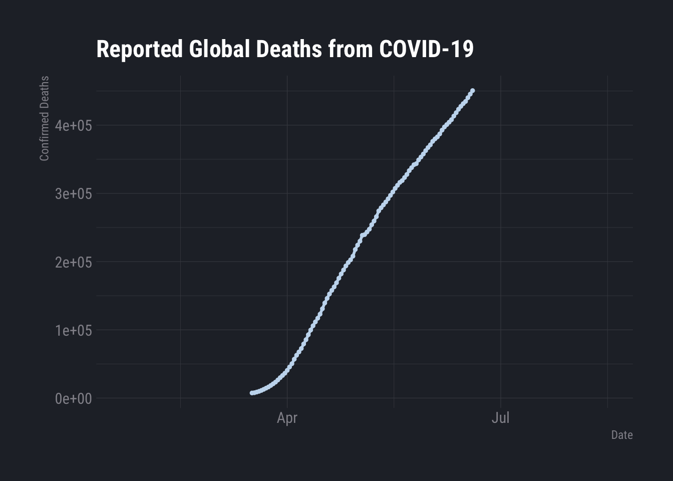
That is legitimately odd.
TS2 <- read_csv(url("https://raw.githubusercontent.com/CSSEGISandData/COVID-19/master/csse_covid_19_data/csse_covid_19_time_series/time_series_covid19_deaths_global.csv"))
Tidy.Counts <- TS2 %>% pivot_longer(., cols=c(5:dim(TS2)[[2]]), names_to = "date", values_to = "Cases")
The US Counties Data
library(urbnmapr); library(ggthemes)
USCounties <- read_csv("https://raw.githubusercontent.com/nytimes/covid-19-data/master/us-counties.csv")
##
## ── Column specification ────────────────────────────────────────────────────────
## cols(
## date = col_date(format = ""),
## county = col_character(),
## state = col_character(),
## fips = col_character(),
## cases = col_double(),
## deaths = col_double()
## )library(tigris); library(rgdal); library(htmltools); library(viridis); library(sf); library(viridis)## To enable
## caching of data, set `options(tigris_use_cache = TRUE)` in your R script or .Rprofile.## Loading required package: sp## rgdal: version: 1.5-23, (SVN revision 1121)
## Geospatial Data Abstraction Library extensions to R successfully loaded
## Loaded GDAL runtime: GDAL 3.1.4, released 2020/10/20
## Path to GDAL shared files: /Library/Frameworks/R.framework/Versions/4.0/Resources/library/rgdal/gdal
## GDAL binary built with GEOS: TRUE
## Loaded PROJ runtime: Rel. 6.3.1, February 10th, 2020, [PJ_VERSION: 631]
## Path to PROJ shared files: /Library/Frameworks/R.framework/Versions/4.0/Resources/library/rgdal/proj
## Linking to sp version:1.4-5
## To mute warnings of possible GDAL/OSR exportToProj4() degradation,
## use options("rgdal_show_exportToProj4_warnings"="none") before loading rgdal.## Loading required package: viridisLitecounties.t <- get_urbn_map("counties", sf=TRUE) %>% mutate(fips = county_fips)
# Map.Me <- left_join(counties.t,Oregon.COVID, by=c("NAME" = "County"))
Map.Me <- merge(counties.t, USCounties)The county level choropleth is not a very good plot. Too much is missing and it is hard to se any variation at all. The epidemic is currently concentrated.
Map.Me %>% filter(date=="2020-03-28") %>% ggplot(., aes(geometry=geometry, fill=cases)) + geom_sf() + scale_fill_viridis_c() + theme_map()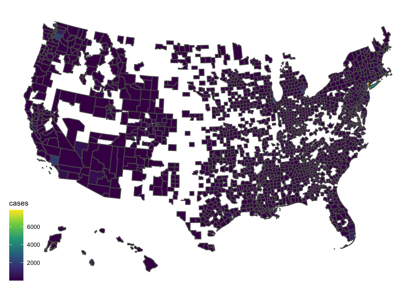
I don’t really like that so I will put it together with a bubble. I have intentionally left out Hawaii and Alaska from this plot.
library(rnaturalearth)
# devtools::install_github("hafen/housingData")
Map.Me.2 <- left_join(housingData::geoCounty, USCounties, by="fips")
MM3 <- merge(counties.t,Map.Me.2)
Map1 <- counties.t %>% ggplot(., aes(geometry=geometry)) + geom_sf(color="black", size=0.1, alpha=0.2, fill="white")
Shorty <- MM3 %>% filter(date=="2020-03-28")
world <- ne_countries(scale = "medium", returnclass = "sf")
counties <- st_as_sf(maps::map("county", plot = FALSE, fill = TRUE))
ggplot(data = world) + geom_sf() +
  geom_sf(data = counties, color = "grey", alpha=0.1, size=0.1) +
  coord_sf(xlim = c(-130, -65), ylim = c(20, 55), expand = FALSE) +
  geom_point(data=Shorty, aes(y=lat, x=lon, color=cases, fill=cases, size=cases), alpha=0.35, shape=21, color="red", inherit.aes = FALSE) +
  scale_size(range = c(.1, 24)) +
  guides(size=FALSE) +
  scale_fill_continuous_tableau(palette = "Red") +
  labs(title="COVID-19 by County Reporting") + theme_map()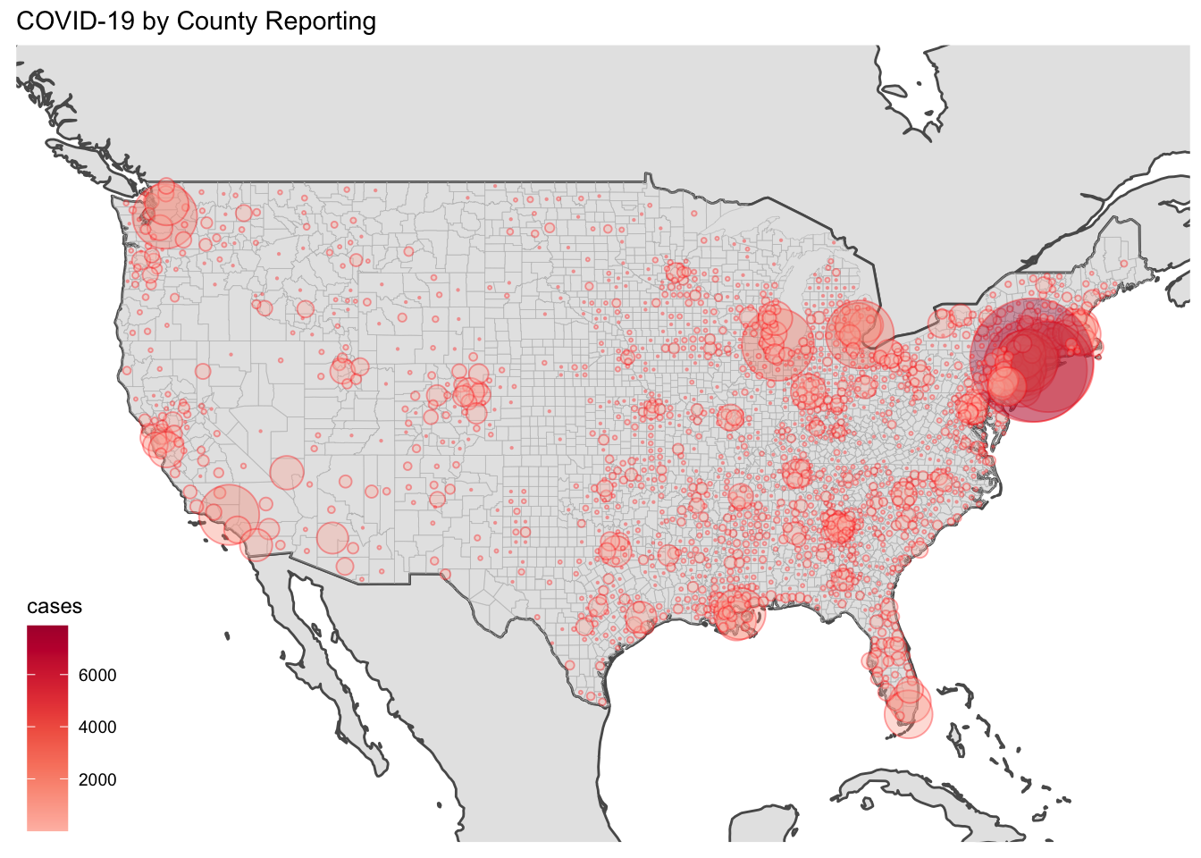
A Leaflet
library(leaflet)
MM2 <- Map.Me.2 %>% filter(date=="2020-03-28")
mytext <- paste("County: ", MM2$county.x, "<br/>",
   "State: ", MM2$state.x, "<br/>",
   "Cases: ", MM2$cases, "<br/>",
   "Deaths: ", MM2$deaths, sep="") %>%
   lapply(htmltools::HTML)
mypalette <- colorNumeric(palette="viridis", domain=Map.Me.2$cases, na.color="transparent")
m <- Map.Me.2 %>% filter(date=="2020-03-28") %>% leaflet(.) %>%
  addTiles()  %>%
  addCircleMarkers(~lon, ~lat, fillColor = ~mypalette(cases), fillOpacity = 0.2, color="white", radius = ~ sqrt(cases)/2, stroke=FALSE,    label = mytext, labelOptions = labelOptions( style = list("font-weight" = "normal", padding = "3px 8px"), textsize = "13px", direction = "auto")) %>% addLegend(pal=mypalette, values=~cases, opacity=0.9, title = "Cases", position = "bottomright")
m