Datasaurus Dozen
The datasaurus dozen
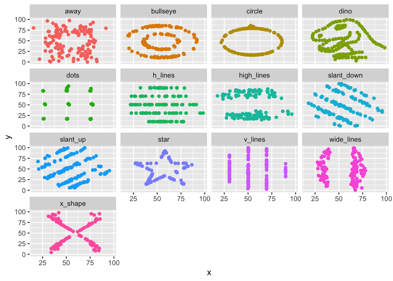
The datasaurus dozen is a fantastic teaching resource for examining the importance of data visualization. Let’s have a look. The basic idea is that all thirteen (datasaurus plus 12) contain nearly identical means and standard deviations though they do vary if the five number summaries are deployed. The scatterplots that are derived from data with similar x-y summaries is a useful reminder that data science is about patterns, not just statistics.
datasaurus <- readr::read_csv('https://raw.githubusercontent.com/rfordatascience/tidytuesday/master/data/2020/2020-10-13/datasaurus.csv')##
## ── Column specification ────────────────────────────────────────────────────────
## cols(
## dataset = col_character(),
## x = col_double(),
## y = col_double()
## )Two libraries to make our work easy.
library(tidyverse)
library(skimr)
First, the summary statistics. Summary statistics are great but they are no substitute for basic data familiarity. Notice, we have nearly identical means and standard deviations though the five number summaries do vary.
datasaurus %>% group_by(dataset) %>% skim_to_wide(x,y) %>% knitr::kable("html", 2) %>% scroll_box(width="100%", height="500px")| skim_type | skim_variable | dataset | n_missing | complete_rate | numeric.mean | numeric.sd | numeric.p0 | numeric.p25 | numeric.p50 | numeric.p75 | numeric.p100 | numeric.hist |
|---|---|---|---|---|---|---|---|---|---|---|---|---|
| numeric | x | away | 0 | 1 | 54.27 | 16.77 | 15.56 | 39.72 | 53.34 | 69.15 | 91.64 | ▁▇▃▇▁ |
| numeric | x | bullseye | 0 | 1 | 54.27 | 16.77 | 19.29 | 41.63 | 53.84 | 64.80 | 91.74 | ▂▆▇▅▂ |
| numeric | x | circle | 0 | 1 | 54.27 | 16.76 | 21.86 | 43.38 | 54.02 | 64.97 | 85.66 | ▅▃▇▅▃ |
| numeric | x | dino | 0 | 1 | 54.26 | 16.77 | 22.31 | 44.10 | 53.33 | 64.74 | 98.21 | ▅▇▇▅▂ |
| numeric | x | dots | 0 | 1 | 54.26 | 16.77 | 25.44 | 50.36 | 50.98 | 75.20 | 77.95 | ▂▁▇▁▅ |
| numeric | x | h_lines | 0 | 1 | 54.26 | 16.77 | 22.00 | 42.29 | 53.07 | 66.77 | 98.29 | ▅▇▇▅▁ |
| numeric | x | high_lines | 0 | 1 | 54.27 | 16.77 | 17.89 | 41.54 | 54.17 | 63.95 | 96.08 | ▂▅▇▃▁ |
| numeric | x | slant_down | 0 | 1 | 54.27 | 16.77 | 18.11 | 42.89 | 53.14 | 64.47 | 95.59 | ▂▅▇▃▁ |
| numeric | x | slant_up | 0 | 1 | 54.27 | 16.77 | 20.21 | 42.81 | 54.26 | 64.49 | 95.26 | ▃▆▇▃▂ |
| numeric | x | star | 0 | 1 | 54.27 | 16.77 | 27.02 | 41.03 | 56.53 | 68.71 | 86.44 | ▅▇▇▃▆ |
| numeric | x | v_lines | 0 | 1 | 54.27 | 16.77 | 30.45 | 49.96 | 50.36 | 69.50 | 89.50 | ▃▇▁▅▁ |
| numeric | x | wide_lines | 0 | 1 | 54.27 | 16.77 | 27.44 | 35.52 | 64.55 | 67.45 | 77.92 | ▇▂▁▇▅ |
| numeric | x | x_shape | 0 | 1 | 54.26 | 16.77 | 31.11 | 40.09 | 47.14 | 71.86 | 85.45 | ▇▆▁▃▅ |
| numeric | y | away | 0 | 1 | 47.83 | 26.94 | 0.02 | 24.63 | 47.54 | 71.80 | 97.48 | ▅▆▃▇▃ |
| numeric | y | bullseye | 0 | 1 | 47.83 | 26.94 | 9.69 | 26.24 | 47.38 | 72.53 | 85.88 | ▇▆▃▅▇ |
| numeric | y | circle | 0 | 1 | 47.84 | 26.93 | 16.33 | 18.35 | 51.03 | 77.78 | 85.58 | ▇▁▁▂▆ |
| numeric | y | dino | 0 | 1 | 47.83 | 26.94 | 2.95 | 25.29 | 46.03 | 68.53 | 99.49 | ▇▇▇▅▆ |
| numeric | y | dots | 0 | 1 | 47.84 | 26.93 | 15.77 | 17.11 | 51.30 | 82.88 | 94.25 | ▇▁▇▁▆ |
| numeric | y | h_lines | 0 | 1 | 47.83 | 26.94 | 10.46 | 30.48 | 50.47 | 70.35 | 90.46 | ▆▇▇▅▅ |
| numeric | y | high_lines | 0 | 1 | 47.84 | 26.94 | 14.91 | 22.92 | 32.50 | 75.94 | 87.15 | ▇▁▁▃▅ |
| numeric | y | slant_down | 0 | 1 | 47.84 | 26.94 | 0.30 | 27.84 | 46.40 | 68.44 | 99.64 | ▆▇▇▅▆ |
| numeric | y | slant_up | 0 | 1 | 47.83 | 26.94 | 5.65 | 24.76 | 45.29 | 70.86 | 99.58 | ▇▇▇▅▅ |
| numeric | y | star | 0 | 1 | 47.84 | 26.93 | 14.37 | 20.37 | 50.11 | 63.55 | 92.21 | ▇▂▂▅▅ |
| numeric | y | v_lines | 0 | 1 | 47.84 | 26.94 | 2.73 | 22.75 | 47.11 | 65.85 | 99.69 | ▇▆▇▃▅ |
| numeric | y | wide_lines | 0 | 1 | 47.83 | 26.94 | 0.22 | 24.35 | 46.28 | 67.57 | 99.28 | ▇▇▇▅▆ |
| numeric | y | x_shape | 0 | 1 | 47.84 | 26.93 | 4.58 | 23.47 | 39.88 | 73.61 | 97.84 | ▇▇▂▆▅ |
Notice that all of the datasets are nearly identical. But have a look at them.
DP <- datasaurus %>% ggplot() + aes(x=x, y=y, color=dataset, group=dataset) + geom_point() + guides(color=FALSE) + facet_wrap(vars(dataset))
DP