Simple Oregon County Mapping
Some Data for the Map
I want to get some data to place on the map. I found a website with population and population change data for Oregon in .csv format. I cannot direct download it from R, instead I have to button download it and import it.
library(tidyverse)## ── Attaching packages ─────────────────────────────────────── tidyverse 1.3.0 ──## ✓ ggplot2 3.3.3 ✓ purrr 0.3.4
## ✓ tibble 3.0.6 ✓ dplyr 1.0.4
## ✓ tidyr 1.1.2 ✓ stringr 1.4.0
## ✓ readr 1.4.0 ✓ forcats 0.5.1## ── Conflicts ────────────────────────────────────────── tidyverse_conflicts() ──
## x dplyr::filter() masks stats::filter()
## x dplyr::lag() masks stats::lag()# Oregon.Population <- read.csv("~/Downloads/data.csv", stringsAsFactors = FALSE)
Oregon.Population <- structure(list(CTYNAME = c("Multnomah County", "Washington County",
"Clackamas County", "Lane County", "Marion County", "Jackson County",
"Deschutes County", "Linn County", "Douglas County", "Yamhill County",
"Benton County", "Josephine County", "Polk County", "Umatilla County",
"Klamath County", "Coos County", "Columbia County", "Lincoln County",
"Clatsop County", "Malheur County", "Tillamook County", "Wasco County",
"Union County", "Jefferson County", "Crook County", "Hood River County",
"Curry County", "Baker County", "Morrow County", "Lake County",
"Harney County", "Grant County", "Wallowa County", "Gilliam County",
"Sherman County", "Wheeler County"), Pop = c(811880L, 597695L,
416075L, 379611L, 346868L, 219564L, 191996L, 127335L, 110283L,
107002L, 92101L, 87393L, 85234L, 77516L, 67653L, 64389L, 52377L,
49388L, 39764L, 30725L, 26787L, 26505L, 26461L, 24192L, 23867L,
23428L, 22813L, 16006L, 11372L, 7879L, 7329L, 7176L, 7081L, 1894L,
1708L, 1366L), GrowthRate = c(10.1166, 12.4237, 10.4262, 7.8676,
9.7854, 7.9772, 21.7144, 8.9385, 2.4611, 7.7563, 7.6273, 5.4516,
12.8255, 1.8674, 2.013, 2.1869, 6.123, 7.3652, 7.2211, -1.9936,
6.0703, 4.825, 2.833, 11.6898, 14.2782, 4.3796, 1.9439, -0.6332,
1.4361, 0.0635, -0.9595, -3.8585, 0.984, 0.6376, -3.991, -5.5978
)), class = "data.frame", row.names = c(NA, -36L))Build Some Maps
urbnmapr from the Urban Institute has a bunch of useful maps.
To install it from GitHub, try
devtools::install_github("UrbanInstitute/urbnmapr")The Oregon Map
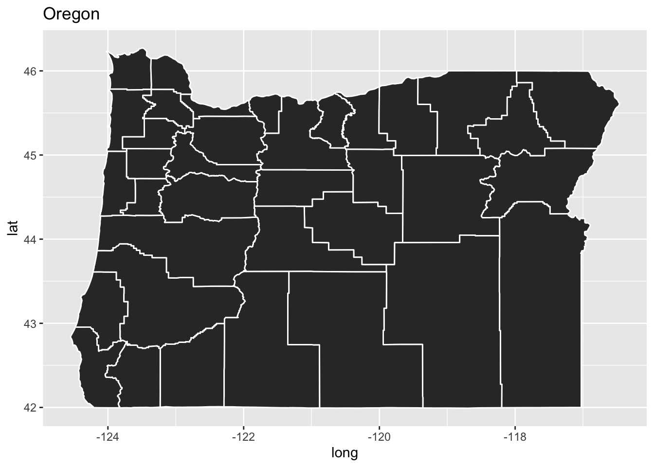
First, just to plot the map. I will pull their counties map, then filter off Oregon, merge the data, and plot it.
library(urbnmapr)
counties %>%
  filter(state_name == "Oregon") %>% # drop the other states
  ggplot() + aes(x=long, y=lat, group=group) +  # lat and long with a group for the polygons; the countries have complex shapes.
  geom_polygon(color="white") + # draw the county polygons with white boundaries.
  labs(title="Oregon") # A title
Population by Counties in Oregon
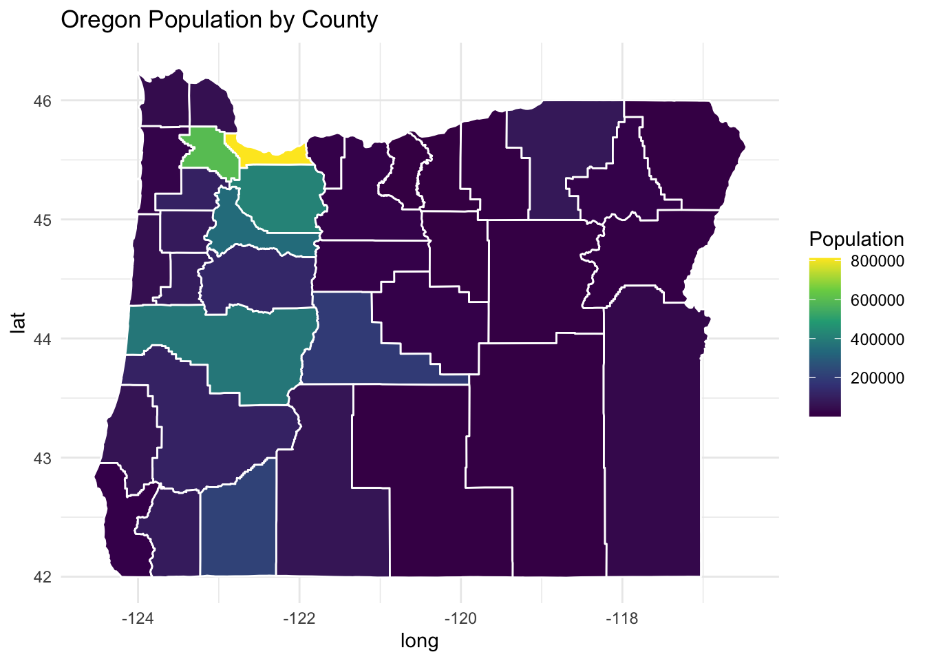
Now I want to add to that map. I need to left_join the counties and add a fill to the previous aesthetic.
( p1 <- counties %>%     # the data
  filter(state_name == "Oregon") %>% # drop the other states
  left_join(., Oregon.Population, by=c("county_name" = "CTYNAME")) %>% # join the population data with the map.
  ggplot() + aes(x=long, y=lat, group=group, fill=Pop) +  # lat and long with a group for the polygons; the countries have complex shapes.
  geom_polygon(color="white") + # draw the county polygons with white boundaries.
  labs(fill = "Population", title="Oregon Population by County") + # labels
    theme_minimal() + # Remove clutter from the theme
    scale_fill_viridis_c() )
Changes in Population
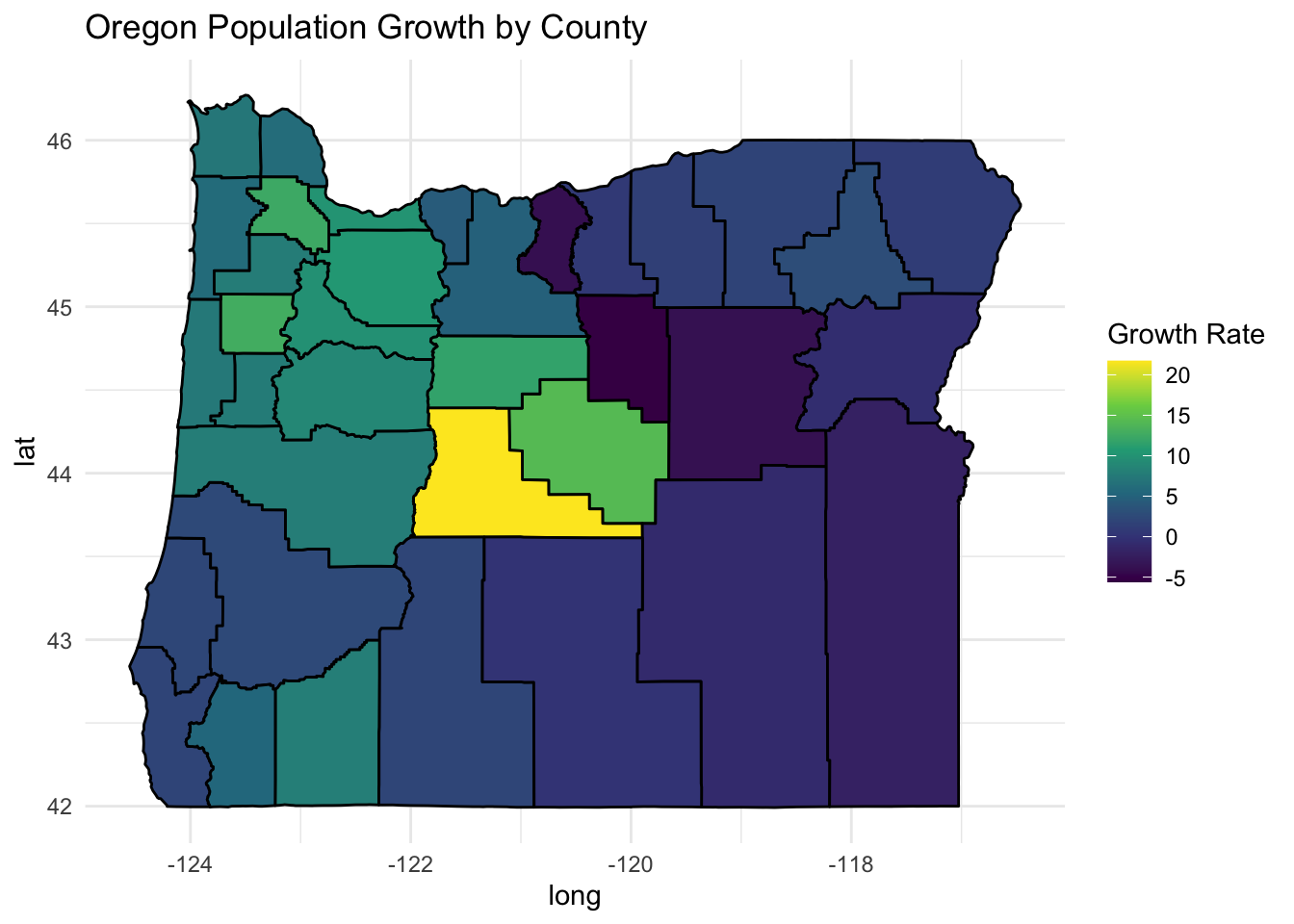
Same as above, just plot something different, the change in population.
(counties %>%
   filter(state_name=="Oregon") %>%
   left_join(., Oregon.Population, by=c("county_name" = "CTYNAME")) %>%
   ggplot(., aes(x=long, y=lat, group=group, fill=GrowthRate)) +
   geom_polygon(color="black", size=0.5) +
   theme_minimal() + scale_fill_viridis_c() +
   labs(fill = "Growth Rate", title="Oregon Population Growth by County") -> p2)
grid.arrange
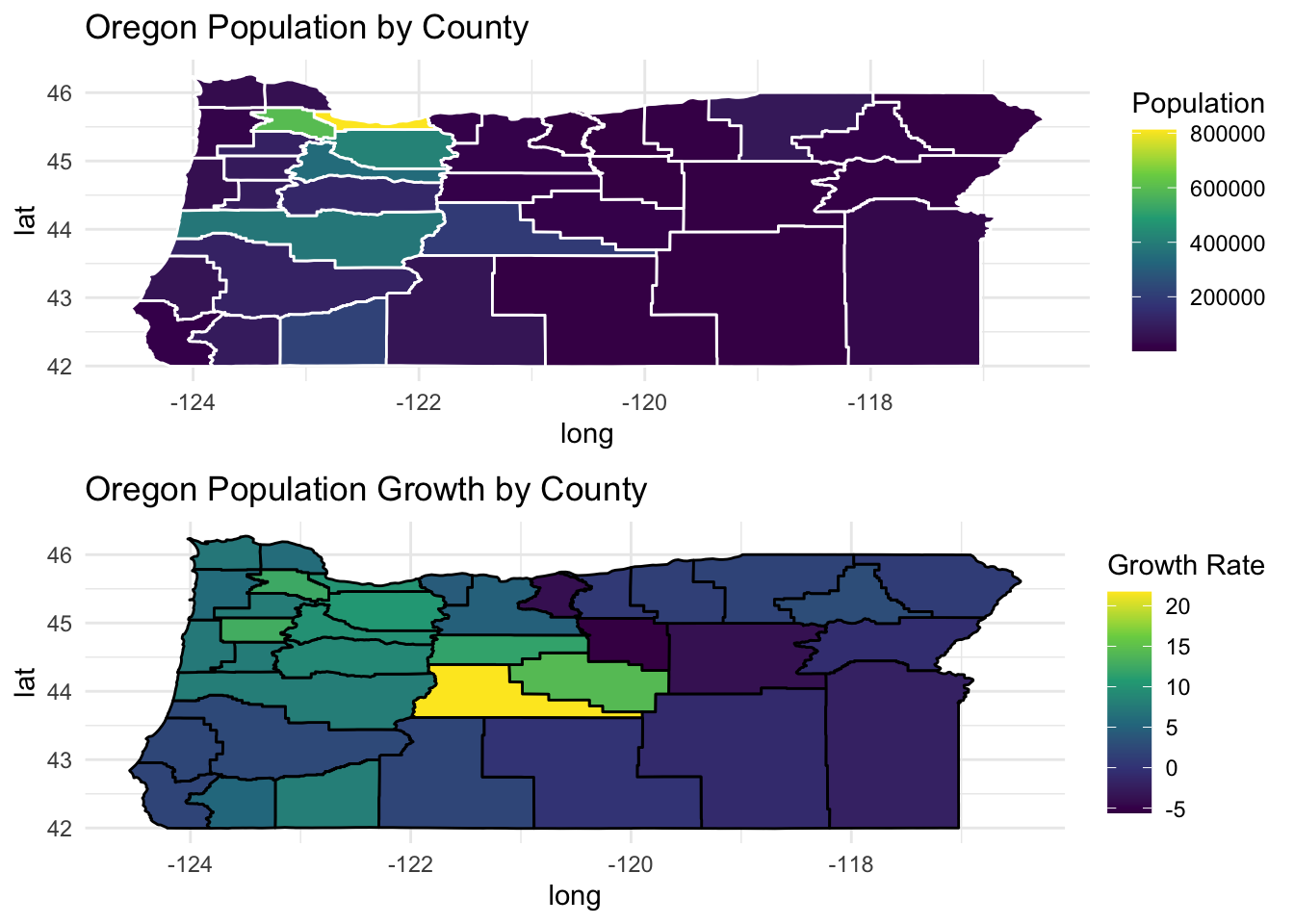
Put them together with grid.arrange.
library(gridExtra)##
## Attaching package: 'gridExtra'## The following object is masked from 'package:dplyr':
##
## combinegrid.arrange(p1,p2)