tidyTuesday - Tuition
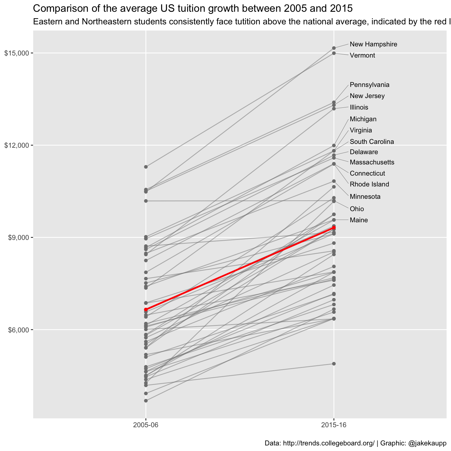
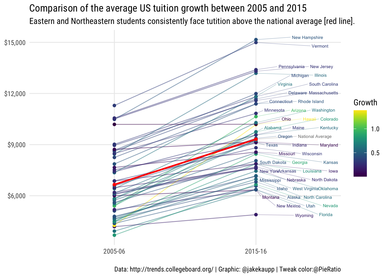
I found a great example on tidyTuesday that I wanted to work on. @JakeKaupp tweeted his #tidyTuesday: a very cool slope plot of tuition changes averaged by state over the last decade. It is a very informative graphic. The only tweak is a simple embedded line plot that uses color in a creative way to show growth rates. All of the R code for this is on Jake Kaupp’s GitHub. The specific file is here. I did not add much. All I wanted was some idea of how the growth rates correspond over the period. I added a cumulative growth rate and encoded the color scheme with it enabling me to play with viridis. The col_tab is my creation. I also moved around the labels so that everyone gets a color coded label and we can see who is where, more or less. Enjoy!
library(readxl)
library(tidyverse)
library(glue)
library(ggrepel)
library(viridis)
tidy_data <-  readRDS(url("https://github.com/robertwwalker/academic-mymod/raw/master/data/tuition/Tuition.rds")) %>%
  gather(year, avg_tuition, -State) %>%
  rename(state = State)

# tidy_data <-  readRDS("../../data/tuition/Tuition.rds") %>%
#  gather(year, avg_tuition, -State) %>%
#  rename(state = State)

nat_avg <- tidy_data %>%
  filter(year %in% c("2005-06", "2015-16")) %>%
  group_by(year) %>%
  summarize(avg_tuition = mean(avg_tuition)) %>%
  mutate(state = "National Average")


plot_data <- tidy_data %>%
  filter(year %in% c("2005-06", "2015-16")) %>%
  left_join(select(nat_avg, year, nat_avg = avg_tuition), by = "year") %>%
  bind_rows(nat_avg)

labels <- plot_data %>%
  group_by(state) %>%
  filter(all(avg_tuition > nat_avg)) %>%
  pull(state) %>%
  unique()

plot <- plot_data %>%
  ggplot(., aes(x = year, y = avg_tuition, group = state)) +
  geom_text_repel(data = filter(plot_data, state %in% labels, year == "2015-16"), aes(label = state), direction = "y", nudge_x = 0.1, segment.size = 0.1, hjust = 0, size = 3) +
  geom_path(color = "grey50", size = 0.5, alpha = 0.5) +
  geom_point(color = "grey50") +
  geom_path(data = nat_avg, color = "red", size = 1) +
  geom_point(data = nat_avg, color = "red") +
  scale_y_continuous(labels = scales::dollar) +
  labs(x = NULL, y = NULL, title = "Comparison of the average US tuition growth between 2005 and 2015", subtitle = "Eastern and Northeastern students consistently face tutition above the national average, indicated by the red line.", caption = "\nData: http://trends.collegeboard.org/ | Graphic: @jakekaupp") +
#  theme_minimal(base_family = "Oswald-Light") +
  theme(panel.grid.minor = element_blank())
print(plot)
Now I will modify the original that is kept intact above.
nat_avg <- tidy_data %>%
  filter(year %in% c("2005-06", "2015-16")) %>%
  group_by(year) %>%
  summarize(avg_tuition = mean(avg_tuition)) %>%
  mutate(state = "National Average")


plot_data <- tidy_data %>%
  filter(year %in% c("2005-06", "2015-16")) %>%
  left_join(select(nat_avg, year, nat_avg = avg_tuition), by = "year") %>%
  bind_rows(nat_avg)

col_tab <- plot_data %>%
    filter(year %in% c("2005-06", "2015-16")) %>%
    group_by(state) %>%
    mutate(Cum.Growth.Rate = ((avg_tuition - lag(avg_tuition))/lag(avg_tuition)))
col_tab <- col_tab %>% drop_na()
# Join Up the color table
plot_data <- plot_data %>% left_join(select(col_tab, state, Cum.Growth.Rate), by="state")
plot_data <- plot_data %>%
              arrange(avg_tuition)

labels <- plot_data %>%
      pull(state) %>%
      unique()

my.plot <- plot_data %>%
  ggplot(., aes(x = year, y = avg_tuition, group = state, colour=Cum.Growth.Rate)) +
  geom_path(size = 0.5, alpha = 0.5) +
  geom_point() + scale_color_viridis(name="Growth") +
  geom_path(data = nat_avg, color = "red", size = 1) +
  geom_point(data = nat_avg, color = "red") +
  scale_y_continuous(labels = scales::dollar) +
  geom_text_repel(data = filter(plot_data, state %in% labels, year == "2015-16"), aes(label = state), direction = "both", nudge_x = 0.4, nudge_y = 1, segment.size = 0.1, size = 2) +
  labs(x = NULL, y = NULL, title = "Comparison of the average US tuition growth between 2005 and 2015", subtitle = "Eastern and Northeastern students consistently face tutition above the national average [red line].", caption = "\nData: http://trends.collegeboard.org/ | Graphic: @jakekaupp | Tweak color:@PieRatio", cex=0.7) +
  theme_minimal(base_family = "Roboto Condensed") +
  theme(panel.grid.minor = element_blank())
ggsave(my.plot, filename = glue('tidyweek-{Sys.Date()}.png'), height = 8, width = 8, dpi = 300)
print(my.plot)
## Warning: ggrepel: 2 unlabeled data points (too many overlaps). Consider
## increasing max.overlaps